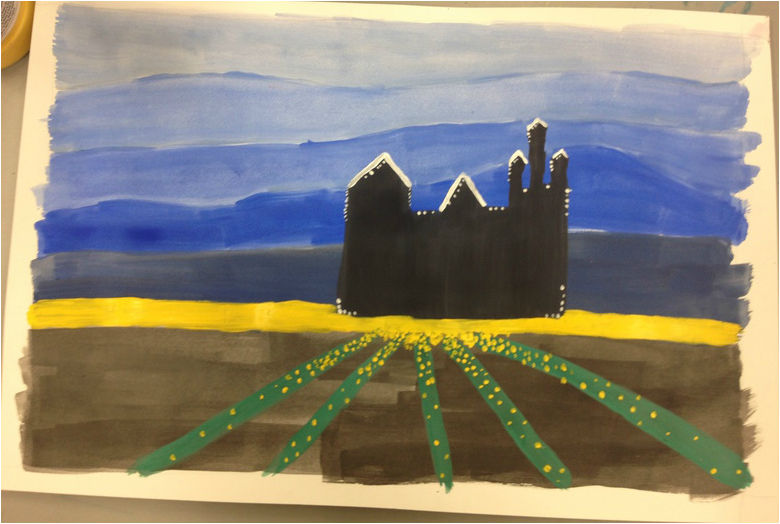
This is my second Disney drawing. The blue layers are the sky in different shades of blue. There is a black castle focal point and yellow dots of detail. I added white detail and dots to outline the castle.
|
|
This is my second Disney drawing. The blue layers are the sky in different shades of blue. There is a black castle focal point and yellow dots of detail. I added white detail and dots to outline the castle.
0 Comments
This is my Disney landscape. I used yellow as the sky and different shades of blue as the layers. There are orange, yellow, and white dots on the largest trees to add detail to the front. There are many little branches to add detail as well. The blues contrast with the light sky. 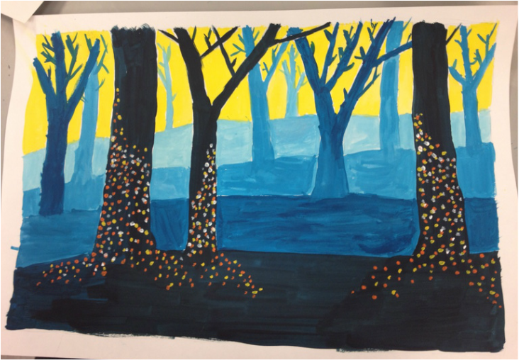 These colors are the three basic complimentary colors. I think they look well together on the picture. There are reflections of blue and yellow together with a red background. They have similar hues and value unlike my other two cut outs. It is a figurative and non narrative notan. 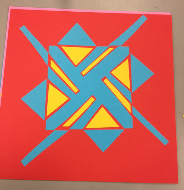 The colors on this notan are contrasting. The black is a very dark color and stands out on the lighter color of the blue. They have a different value and different hues as well. It is a symmetrical cut out as you can see. There are many curves and shapes to this picture as well. It is a non narrative and non figurative notan. 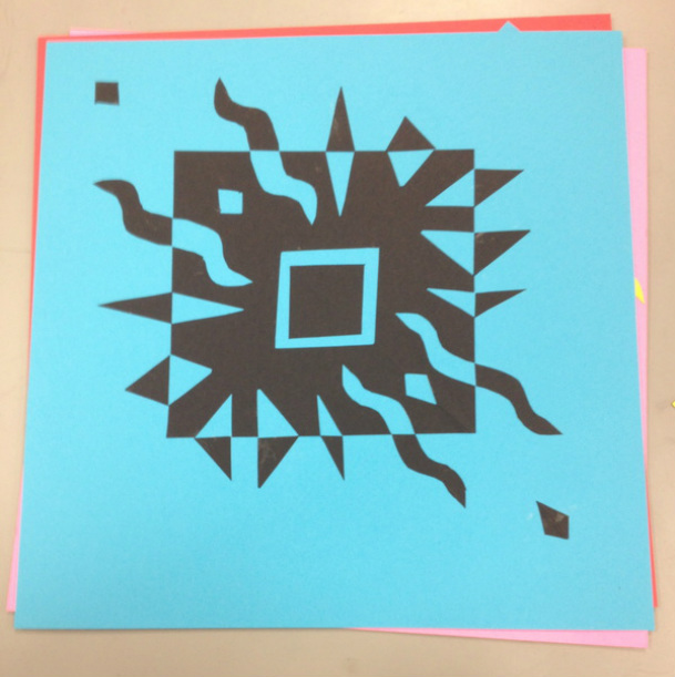 Pink and yellow are contrasting colors. Yellow has less value than the pink. They have different hues as well, the pink is a deeper color than the yellow. It is an asymmetrical picture because there are different shapes and reflections throughout the yellow cut outs. This notan is a nonfigurative picture and is also non narrative. 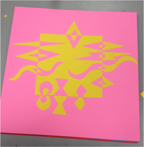 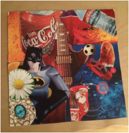 This is my third collage. In this collage I'm contrasting different images to create a deeper meaning. At first I started looking at simpler images to contrast such as the water bottle and the fire (water vs fire), the lion and the car, and the coca cola can and the plastic (metal vs plastic). But, as I progressed further in the project I found deeper meanings within things I could contrast. For example, The flower and the jewels in the bottom corner are both considered beautiful in different ways. The guitar and the soccer ball are both ways people express themselves and may do in their spare time for fun. Also, the batman image and the santa clause are both heroes or figures children look up to in different ways.
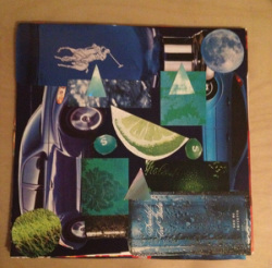 This is my second collage which is based on symmetry. The largest pieces of symmetry in this collage are the cologne bottles and the two cars which outline the sides of the paper. The focal point is the lime. There are three symmetrical triangles that form a triangle. The two teal and green skittles are also symmetrical to each other as well as the blue-green patterned squares nearby. The rectangular images of water and a green bottle are symmetrical. Lastly
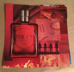 This is my first collage. It creates the illusion of space because there are darker colors in the back with some light color on top of the darker colored pieces. The RSVP cologne is what pops out the most and overlaps a large portion of the collage. the lighter footprint square also overlaps some of the deeper reds. the color works because the deeper reds make the lighter ones on top pop. There is also more movement in the background because of the flames and waves in the pieces. For this picture relative size works in by similar sizes all over and one large piece in the front.
This is my pastel drawing. I resketched this from my pencil portrait drawing of Danielle. I think the face shape is accurate and the placement of the features are close. Softening the color under the eyes, eyebrows, and around the nose created dimension in the drawing. The most emphasis on the face would be the eyebrows because they are the darkest. I did this because in real life, Danielle has very defined eyebrows. Highlights on the cheekbone and nose create dimension in the face as well. There was a difference in texture from the background, the hair, and to the skin because some were more defined. 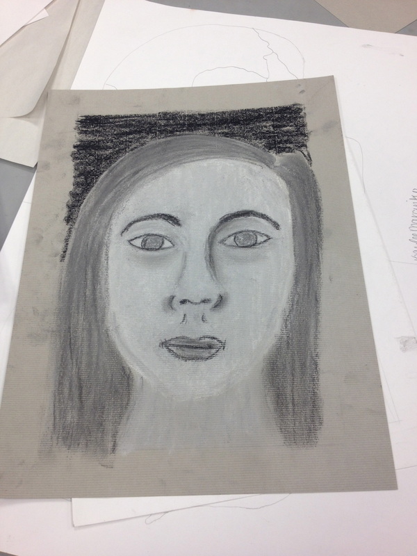 This is my portrait drawing of Danielle. I drew the face shape to the proportions of her face and also the placement of her features. The features are drawn to the correct size in relation to the head; not too large or small. I tried to create the illusion of three dimensions by my drawing of the face. The eyes have the most detail but the drawing itself could use more shadowing. I think I did well with keeping my drawing without smudges as well. 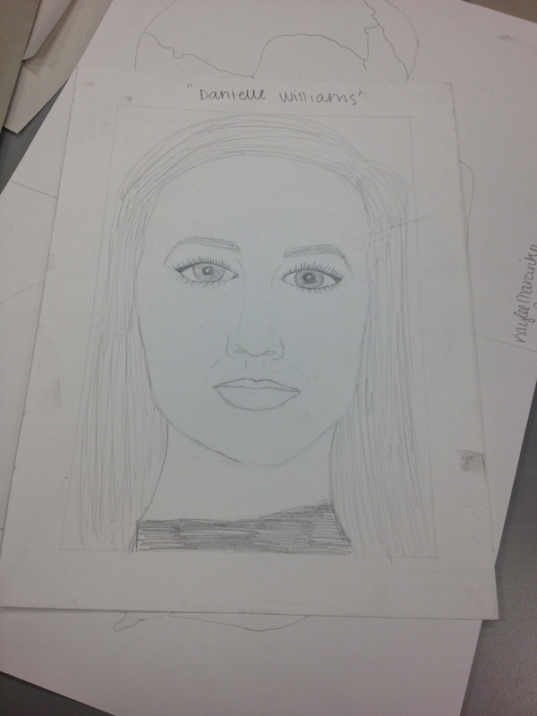 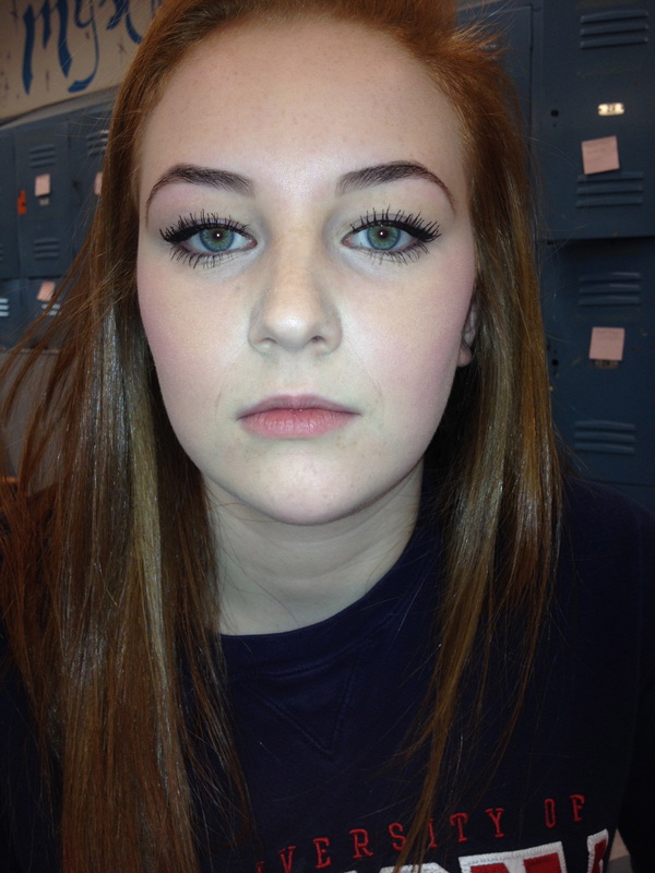 | AuthorWrite something about yourself. No need to be fancy, just an overview. ArchivesJanuary 2014 Categories |
 RSS Feed